It was 3:30 in the morning when I finally pulled myself away from Mass Effect Andromeda. This was after telling myself, “Just one more mission,” for the past hour and some change.
I was starving and knew that I couldn’t fall asleep with hunger pangs, so I groggily pieced together a sandwich. In these moments between putting the game down and finally going to bed, I was given time to pull back and see the bigger picture.
Sure, I had seen small issues with the game throughout the day: enemies floating in the air, quest stations improperly activating missions, characters interacting with things that they clearly weren’t quite close enough to touch, audio cues getting cut off…
But I had to step back and ask myself,”What is the common thread?” And the answer came to me almost immediately: polish.
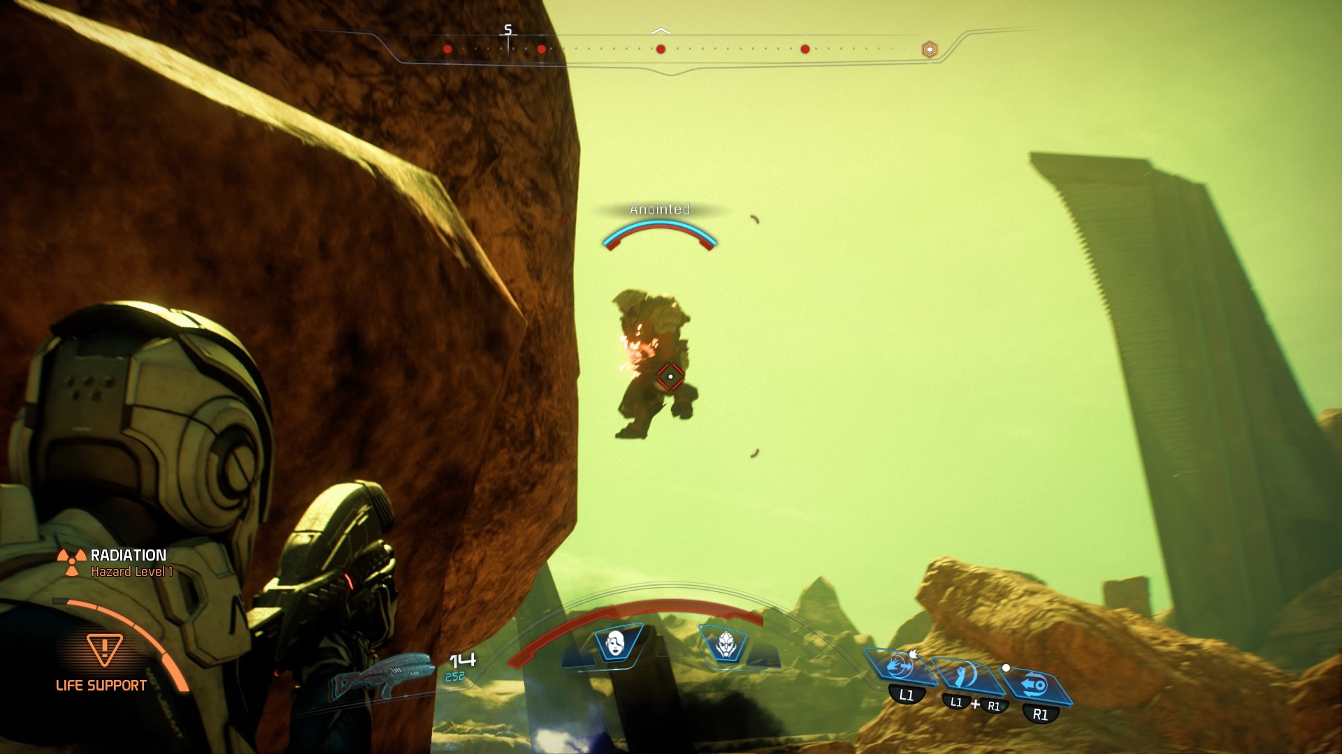
Don’t worry! He’s TOTALLY supposed to float.
After having played for only one day, I was dubious to write about things that might change. For instance, maybe my teammates have just made bad first impressions. Maybe Liam isn’t a snot nosed military dude-bro that I will hate forever. Maybe I have just been statistically unlucky and my glitchy experience with the game is not representative of the overall quality of the game.
If I was going to claim the game to be unpolished after one day, then I wanted something more concrete than floating characters!
It would have been all too easy to grab the low hanging fruit that is Sara “No H” Ryder’s facial expressions, run cycle, or well, you get the point. But I have one better than that: the horrid UI. And I can prove that it is bad by using Jakob Nielsen’s 10 Usability Heuristics for User Interface Design.
Even The Pathfinder Can’t Beat Bad UI
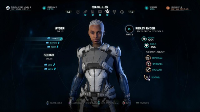
Everything relating to power loadouts is a mess. In Mass Effect Andromeda, you can no longer use abilities from the radial menu. This means the three skills you have hot-keyed are what you are stuck with at any given time. In place of this, the game allows you to save up to four loadouts, which you can switch between at any time.
A loadout not only includes three skills, but it also includes a profile, which is a specialization that infers bonuses to you based upon your allocation of skill points across skill trees. However, the existence of loadouts is poorly explained to the player. In fact, the only reason I knew about loadouts was because I’d both read a tip list and watched a trailer showing off loadouts in the weeks leading up to launch.
Instead of being in plain view, it is tucked down at the bottom of the screen on both the Skill and Profile menus. This is where it tells you to press the touchpad to open Favorites.
This breaks the heuristic “Recognition Rather than Recall” by ensuring that you always have to remember a series of hard-to-see steps rather than just hitting the giant “Favorites” option on the pause menu. Just to be clear: You cannot access the favorites menu via the main pause menu; it is tucked away within sub-menus. This is the inverse of the “Aesthetic & Minimalist Design.” When reducing the number of readily available options you never want to make it such that you are removing an option that people would want to use often.
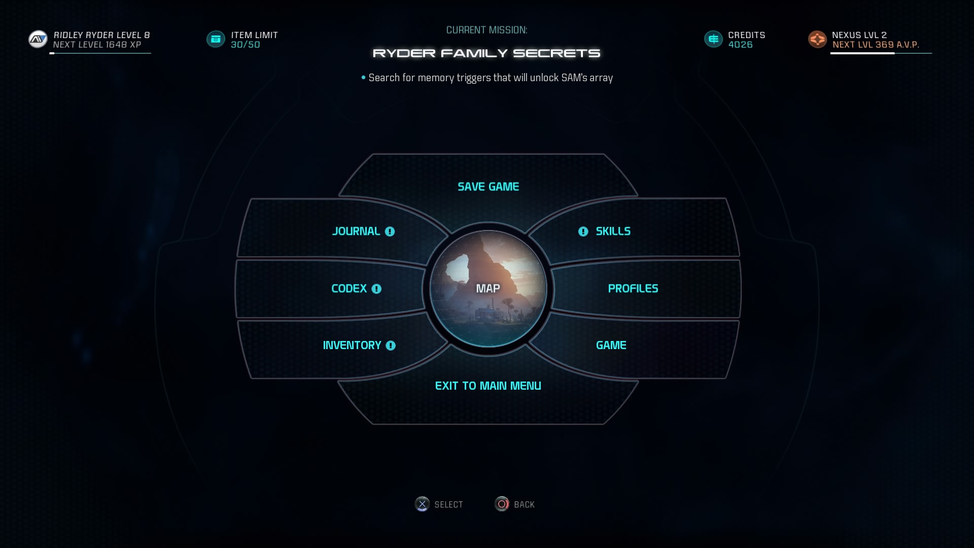
No “Favorites” in sight.
If making it difficult to find loadouts wasn’t bad enough for you, then making the loadouts cumbersome to customize should hopefully convince you.
There is no way to go to the favorites menu and directly set up your loadouts. Instead, you must go to the skill screen, equip three skills, go to the Profile screen, choose your specialization, then go to the favorites screen and save your current loadout. This doesn’t specifically break the definition of “Flexibility and Efficiency of Use,” but it certainly breaks the spirit of the rule.
It is also easy to accidentally overwrite previous loadouts forcing you to repeat the process. This breaks “Error Prevention” and “User Control & Freedom” as it neither displays a dialogue to stop you from accidentally overwriting a set of abilities nor does it support redo/undo.
Even swapping loadouts in combat is hidden. Opening the radial menu reveals all of your currently equipped weapons/consumables. Then you have to press square on this menu to swap to the favorites menu, thus allowing you to swap your loadout.
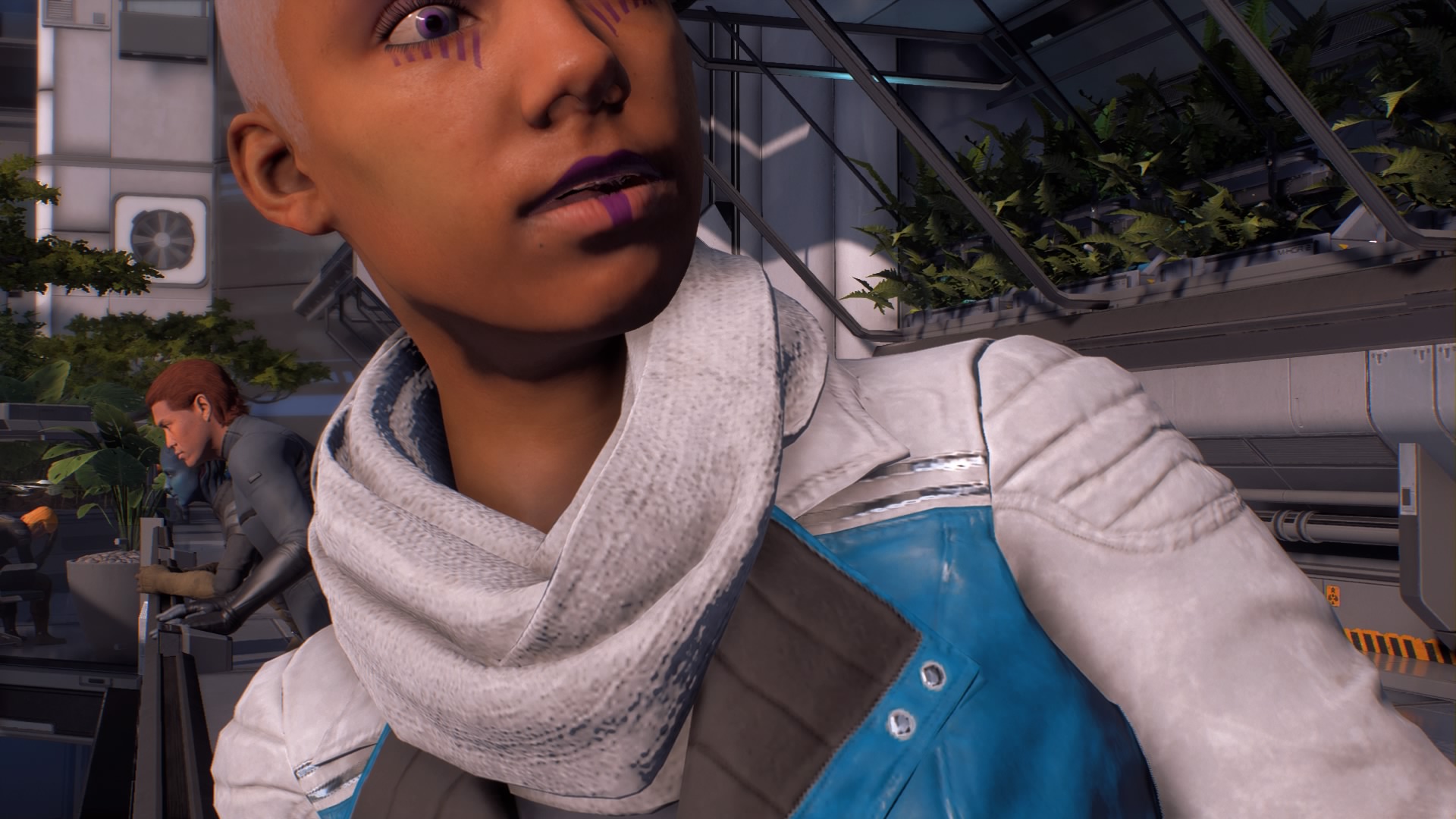
The camera loves to cut your face off.
That’s Not It…
This is just one of the many confusing UI decisions in the game, but the crafting system is similarly painful to use. Also, don’t believe that only the UI breaks these heuristics. The whole UX (User experience) is harmed by this.
For instance, the game breaks the “Consistency and Standards” it set by making you get into the Nomad with triangle, but get out of it with circle. Holding triangle sends you back to your ship. Having to press both L1 and R1 at the same time breaks “Error Prevention” in half!
The horrid UI in some cases makes actual targeted design decisions feel clunky in other places. For instance, you can only swap weapons and teammates at predefined waypoints. It works well in conjunction with other mechanics, such as the life support systems, to make the game feel more like you’re ruggedly surviving on a new, largely uncharted planet. But in the presence of the horrible way the favorites menu is handled it just looks like another clunky use of UI.
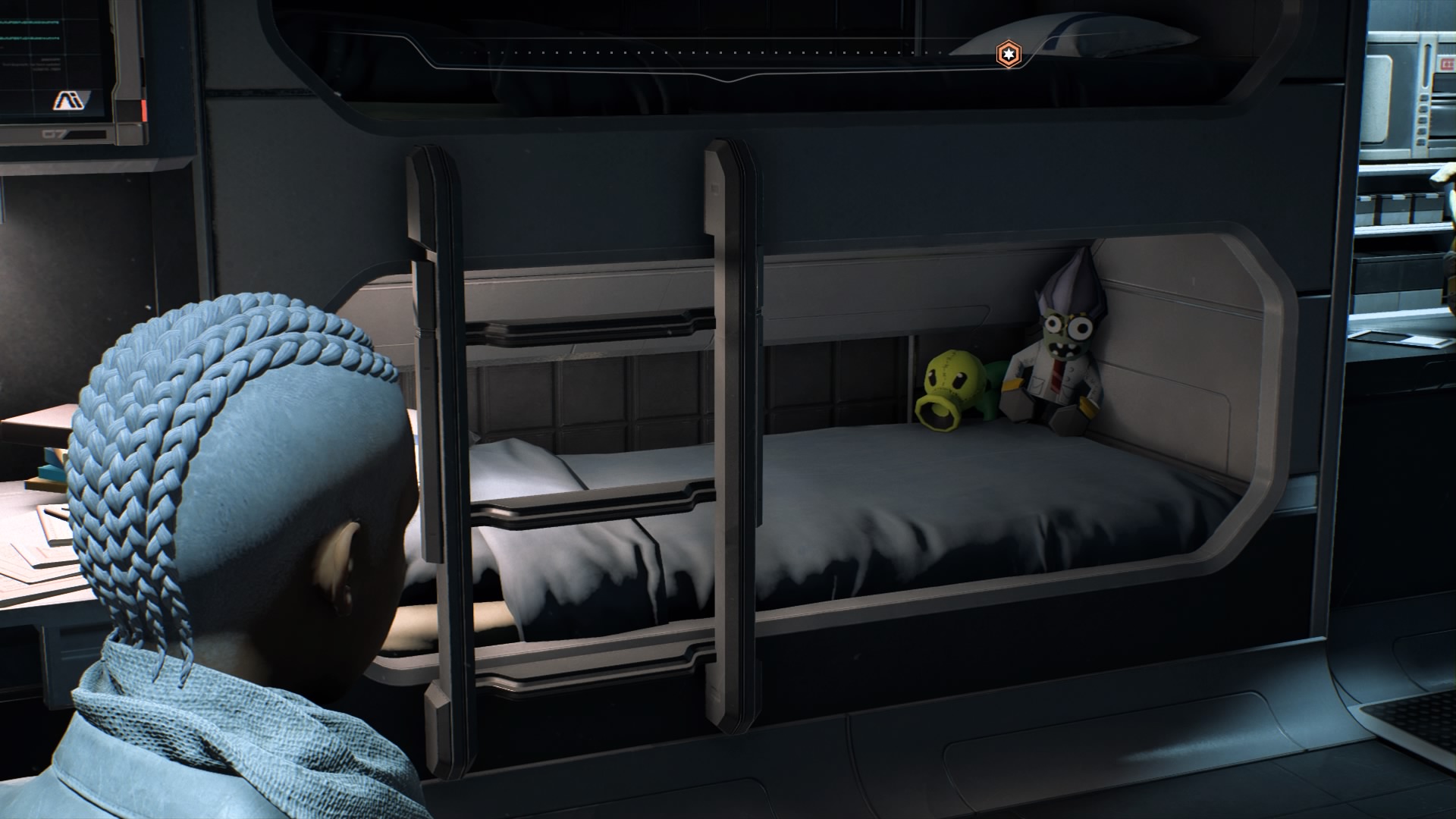
Obligatory Plants vs Zombies reference for the win!
It’s Not ALL Bad
Being able to go to the Favorites menu from the Skills or Profile Menu is a good thing. It supports “Flexibility and Ease of Use” by providing experienced users with a shortcut.
That was never the problem, though. The problem was that this is the only way to reach that menu and that once you reach it you have to copy your current loadout. Moreover, removing abilities from the radial menu can be seen as proper use of “Aesthetic and Minimalist Design” or possibly a misuse of “Flexibility and Efficiency of Use.”
—
I think a lot of us who were anticipating Mass Effect Andromeda are left in this Twilight Zone where we feel like the game needed this extra time to be polished and yet we were left high and dry with no Mass Effect games for five years. It feels as if they had plenty of time to make a much more polished game, especially considering that BioWare has produced more polished games in shorter time frames.
For some practical advice on actually wrangling this unwieldy UI, check out my favorites menu guide.
