
There was once a time when video game box art was quite the big deal. Before the age of digital downloads, publishers wanted their products to really stand out on the shelves. This meant putting a truly eye-catching image on the front of a game's packaging, art that would make the public think: "Wow! Now that looks like something I'd like to buy!"
Of course, there were a few times when those who designed these covers got it so very, very wrong. These tragic examples of horrible box art contained everything from child-like drawings, to what could only be described as drug-induced surrealism. Many make you wonder why no-one ever spoke up before these games were released and proclaimed: "Errrmmm...the cover looks like it was designed by a serial killer."
But it's not just retro game packaging of the past that suffered from this crime of bizarre imagery, there have been plenty recent examples of head-scratching box art - especially when it comes to low-budget, indie titles.
With a whole plethora of terrible and terrifying images to pick from, it wasn't easy choosing which made it into the list - it could have had 100 entries.
From gaming's early beginnings to the present day, here are the thirty most bizarre, bewildering, awful, and surreal pieces of video game box art we've ever seen.

30 - Anticipation
While the box may proudly claim "party fun for all ages", the cover seems to suggest otherwise. More '80s than Ronald Regan doing cocaine off the back seat of a DeLorean, this scene looks like a prelude to the world's most boring orgy.
And what exactly are they all watching that could produce such a varied range of emotions? There's pant-wetting laughter, total shock, intense concentration, and the guy in the blue shirt appears to be having a stroke.

29- Lost Lands: Dark Overlord
Nothing says 'Dark Overlord' like a small child carrying a teddy bear. Placing this kid in some kind of otherworldly setting doesn't make this any less of a bad idea for a front cover. Interesting fact: this same picture was used to advertise the TV show To Catch a Predator*
*Not really.

28 - Ken's Labyrinth
Proof that you can produce a game's box art using nothing but Microsoft paint. Notice the stunning use of cut and paste for the background skulls, the vomit-inducing mixture of crap fonts, and the way that possessive apostrophe sticks out so badly due to the over-enthusiastic use of spacing between letters. Well done, Ken. Well done.

27 - Street Sport Basketball
It appears that Epyx really wanted to push the whole 'street = gritty' angle with this one. The guy is wearing the expression of someone who's been kidnapped at gunpoint and is now being forced to make a series of slam dunks; should any miss the hoop, both he and his family will be killed. And all on the very day he wore his best sleeveless t-shirt and ill-fitting, blue sweatpants.

26 - Bad Cat
From an age before cats ruled the internet, we have the slightly too gangster looking (and terribly drawn) Bad Cat. Notice how he causes trouble in the local bar, spray paints walls, and dresses in his gang's colors. In the other 'bubbles' not used in this picture, Bad Cat is taking part in a local drive-by and is later seen smoking some meth.

25 - Tommy Lasorda baseball
It may be Tommy Lasorda's baseball game, but the man himself doesn't exactly boast Adonis-like good looks - so having his face take up the vast majority of the box was a brave move. But why is it, exactly, that his features appear to be in the early stages of melting away like a wax candle? Is he staring into the Ark of the Covenant? We may never know.

24 - Lords of Football
Here we have what must be one of the most misleading representations of a game every created. Lords of Football does not, as the cover suggests, place you in the shoes of a man who becomes master of lightening; rising to control an entire city, while Odin himself casts his all-seeing eye upon you. It is, in fact, a statistic-based simulation of the everyday life of a soccer player. So not too different, then.

23 - Irritating Stick
Irritating Stick gets a place on this list not just because of its atrociously poor quality cover, but also due to that great/awful title. You'd assume the titular stick would look better than a boring, white and blue bar, but maybe it's that lack of design what makes it so irritating. Other names considered for this game included Itchy Pole, Aggravating Rod, and STD Wand.

22 - Ghost House
"Oh God! I've just realised we haven't commissioned any artwork for the Ghost House game box - and it ships tomorrow!"
"Why not just take a picture of you holding the cartridge? People are bound to applaud such out of the box thinking."
"Brilliant! You're promoted! We can't fail!"

21 - Street Warrior
There are many dangers to using the bodybuilding drug Synthol, not only does it result comically out of proportion muscles, but it can also cause head shrinkage and the compulsion to wear tight pants. This can give your dog such a shock, the animal's eyes could disappear and its shadow may stop functioning correctly.

20 - Binary Domain
The Binary Domain box art would be a pretty standard, boring affair were it not for one bad design choice: that guy on the hero's back. For a start, he only seems to be getting a piggy-back because he's got a grazed knee, secondly, he appears to be grasping at his saviour's chest in a very uncomfortable manner, and thirdly, if you look where the main guy's hand is in relation to the person he's carrying, he must be completely crushing his junk - no wonder he looks in so much pain.

19 - Checkers
Creating an image that makes Checkers look cool and sexy was never going to be an easy task, so the advertising execs for this title decide to draw attention away from the fact it's not the most interesting of activities by giving us something mildly sinister: that old man looks far too happy to be just playing checkers, the kid is obviously cheating and loving it, and that king may be a bit misleading for anyone who's never played the game before - this isn't anywhere near as exciting as chess.

18 - Metro Cross
Everyone knows how to identify a skater, they're always wearing those blue spandex bodysuits, red 'shoes', white elbow/knee pads, and an alluring yellow helmet. But more than anything, you can tell a skater from the face they make when they're pulling off a particularly difficult stunt: a cross between a dead-eyed yawn and a scream.

17 - Tongue Of The Fatman
An awful box cover for what was also a truly awful game, at least Tongue Of The Fatman was consistent in its terribleness. You know what would have represented the game better than half a face with CG eyeballs up its nose? Pretty much anything - although a steaming pile of turd would have been a lot more accurate. Also, any Red Dwarf fans will know that they did the whole 'lower face as a mouth' thing much better.

16 - KaRnaaj Rally
KaRnaaj Rally's cover art was the perfect combination of a bad name, zero production values, and a terrible concept. The blurred out car gives more of an impression of poor editing skills as opposed to speed, while one can only assume the guy at the front was a friend of the creator, roped in at the last minute to help. Why the 'artist' digitally added the blue hair and made him look like some crazed, emo junkie is a mystery.

15 - Virtuoso
In Virtuoso, the player takes control of a young Dog The Bounty Hunter, making their way through an endless procession of graphically vile levels. The sheer awfulness of this low-quality imagery has caused Dog to go slightly blind, this unfortunately means he can't aim at the tiny ED-209 sneaking up behind him.

14 - Xenon 2 Megablast
Xenon 2 was a brilliant game from the masters of the era - The Bitmap Brothers. Sadly, the box art for the game resembled a Salvador Dali nightmare. Just looking at it for too long can give you a headache. If it were possible to give a dot matrix printer an acid trip, then this would be the result.

13 - Cock'in
Cock'in also went by the alternate title of 'Chicken Chase', but for some reason it was this name that brought it most attention. The game put you in control of the only cock in a henhouse, protecting your eggs from vermin and occasionally having to mate with chickens (hence the double meaning...see). So, obviously, the best way to represent this simulation of farm life was to put two teenagers on the box cover with chicken hats on, have one hold an egg that blends in horribly with its background, and place a floating fish in the air that feeds on elbows - just for good measure.

12 - Fatal Fury
What the hell is going on here! Not only have these guys somehow managed to have a fist-fight on top of a park bench, but the one in the wifebeater has managed to punch old Marty McFly so hard that he's opened a portal in space-time. Now poor Marty's heading towards a circus from 1890, where he'll be forced to perform against his will as a member of the freak show.

11 - Black Belt
You know when you just can't be bothered to put any effort into something at work? The guy who designed this knows the feeling. Sticking that grid on the background really took it out of him, so you consumers should be grateful to get a small, clip art leg as well. And how awesome is that impact graphic! it has not one, but two primary colors in it!

10 - Crack Down
This was an attempt to recreate one of those '80s VHS covers that showed various parts of the movie in one large image. Sadly for Crackdown, having a goat demon who looks way too pleased with himself, a stormtrooper with a crushed head, and very angry ape all in one picture doesn't make the best looking montage.

9 - Trevor McFur In The Crescent Galaxy
Despite having what can only be described as a truly epic name, Trevor McFur In The Crescent Galaxy's box art may not appeal to most people - unless you're a furry, of course. The whole thing bears a worrying resemblance to some animal hentai - and wouldn't a real leopard eat a cat, rather than make out with it?

8 - Bust-A-Move 2
If you've played any of the Bust-A-Move games then you'll remember its cartoony graphics, fun puzzles, and addictive, Tetris-like gameplay; what you may not remember is the bit where you torture an old man by forcing his eyes open with matchsticks and make him watch snuff movies - which is obviously what's going on here.

7 - Ultimate Duck Hunting
Rather than aiming for the ducks, perhaps this hunter should be trying to fend off the giant, disembodied Labrador head that's appeared behind him. Aside from the awful use of Photoshop layers in this image, also notice the helpful subheading of 'hunting & retrieving ducks'. Glad they cleared that up - who'd buy a game where you only hunted them.

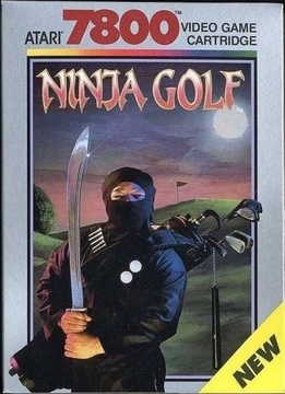
6 - Ninja Golf
What happens to ninjas when they get too old and portly for assassinating Shoguns? They take up golf, naturally. Few games were daring enough to combine the genres of side-scrolling beat-em-up and golf simulation the way Ninja Golf did, so coming up with a good image to represent both these worlds was important. Is the fact this Ninja looks a bit over the hill and rotund intentional? Perhaps. And hanging his nunchucks on the clubs was definitely a nice touch - practical... yet deadly. Though I'm not sure about the placement of those golf balls.

5 - Cho Aniki
Not entirely surprisingly, the vast majority of the Cho Aniki games were never released outside of their native Japan. This one is probably the most bewildering of all the series' covers, though none are what you would call 'standard'. The games are famed (again, in Japan) for their use of muscular men and homoerotic imagery, as you can see from the box art. Although, how Thomas the Tank engine fits into this, I'm not quite sure - he certainly has a look of shock on his face.

4 - Paws and Claws: Pet Vet
A prime example of why you should never drink a bottle of whisky before using Photoshop. Just look at the girl's hands, could they possibly be any more randomly placed? It appears they've left her body and have become sentient beings. And the way those animals are blended into the background is truly a thing of wonder. This bears the quality of something a grandparent who just discovered photo editing software would produce, possibly as a tacky, home-made Xmas card.

3 - Phalanx
How many people looked at this design before it was released and okayed it? Surely out of all of them, someone would have said "eerrmm... what's with the old hillbilly playing a banjo? I thought we made a space shooter." The image is so surreal in its context, one can only assume it was put there in order to give the game more attention - which it did. Will this style of box art ever be seen again? Could the same designer one day work on a city simulator and stick a badger riding a unicycle on the front cover?

2 - Winning Post 3
Oh Japan... only you could take the rather mundane sport of horse racing and turn it into something so terrifyingly sinister. As if having a giant schoolgirl leading a pack of horses isn't bizarre enough, you just had to put a weird, eyes wide shut-style mask on her as well. Still not messed up enough? Then how about the deranged old man in the bottom corner who's also hiding his features. He looks like the last thing someone would see before they were murdered.

1 - Blood 'N Guts
I just don't know where to begin with this one. The first thing that hits you is the fact it seems to have been drawn by a twelve-year-old boy - using only chalk; the horn that the guy on the left is holding appears to be having an orgasm; the 'T' in 'GUTS' is obviously an upwards pointing arrow; the longer you stare at the kneeling dude's legs, the less they make sense; and to cap off this entire monstrosity, a house cat has wandered into the scene. It's obviously a tough feline, as it doesn't seem to mind the moustached/mulleted barbarian with wandering nipples standing on its tail.


Published: Jun 18, 2015 04:51 am